How to create a website from scratch
Image by pngwing.com
Creating websites may seem like something only professional web developers are capable of doing, but in reality, as I hope to show in this article, anyone can write simple websites (even really good-looking ones) and publish them on the Internet with only a little effort, and without spending a single cent!
Unfortunately, not a lot of people seem to have the knowledge to do that, which is a shame because it leads people to believe that the only way for them to have a voice on the Internet is by using social media, which limits what you can do and how you can express yourself.
I am writing this blog post in order to show people who are not very technical, or know very little about the web, that they, too, can create their own websites and publish content on the internet!
You don’t need to be a programmer or a designer. You don’t need to be very talented either. All you need is some time and creativity because, unlike on a multi-billion social media platform, you decide what the content you publish will look like and how it’s presented.
As you’ll learn by the end of this tutorial, HTML, the main technology used to create websites, is quite easy to understand and use! In fact, HTML comes from a tradition of markup languages used by writers, not by programmers, to publish articles and academic papers before websites or the Internet even existed!
To get started, you will need only two things, both of which you almost certainly already have on our computer:
- a simple text editor. Anything will do, even Notepad on Windows, or TextEdit on Mac, for example, but it’s even better if you can get something that recognizes HTML, like Notepad++ or the most popular editor today for web development, VS Code.
- a web browser like Google Chrome or FireFox.
Ready to start? Let’s do it!
A Basic Introduction to HTML
Open your favorite text editor and type (or copy/paste) the following text into a new file:
<title>My Website</title>
<h1>This is my website</h1>
Save this file as index.html on any directory you like. index.html is traditionally the entry point of any website.
Open the file in your web browser by selecting the Menu File > Open File... and picking it in the file chooser.
If everything went well, you should see your first website (with, so far, a single web page in it):
The gray borders you see above wraps the area of the web page produced by the HTML we’ve written so far. If you click on the blue
Try it!button, a new tab will open where you can edit the HTML source and see immediately what happens to the web page (thanks to codepen.io). Do that as often as you can, as it’s a great way to learn how it all works.

Illustration by iconscout
Notice that <title>My Website</title> is not visible on the page. This is used to make the browser show My Website
on the tab header showing this page.
The page only displays the <h1>This is my website</h1> line, but without the h1 part… that’s because HTML is a
markup language: it uses tags to mark up text with information
about how to display it… in this case, we’ve marked This is my website with the h1 tag (or first-level heading tag),
which makes the text bigger, as you would expect for a top document heading.
There are many tags available in HTML, and we’ll meet many more throughout this tutorial… but for the impatient, here’s a full list of HTML tags.
Getting a little formal
Image by NEXTPNG
Before we go on, it’s necessary to introduce some formalities regarding HTML. Don’t worry, it’s a little bit boring, but we’ll get past it in just a few minutes, I promise!
First of all, an HTML document is divided into two main parts: a head and the body proper.
head: contains information about the document itself that the browser needs to know to show it properly.body: all the visible content of the page.
The head contains information like the page’s title (which is shown on the browser’s tab header, as we saw earlier), the location of the little icon you want to be shown on the tab header, and many other things.
In our first example, we didn’t even bother to include a separate head and body (browsers understand it anyway),
but it’s a good idea to do it so things stay organized.
Remember how the <title> element did not appear in
the page in our first example? <title> is one of the tags that must be placed in the head of the HTML document,
and as we’ve just found out, head is not for content, it’s for data about the document (i.e. metadata).
Here’s what index.html looks like with an explicit head and body:
<!doctype html>
<html lang="en">
<head>
    <meta charset="utf-8">
    <title>My Website</title>
</head>
<body>
    <h1>This is my website</h1>
</body>
</html>
The first line, <!doctype html>, tells the browser that this is an HTML document. It would not be strictly necessary
if it wasn’t for historical reasons we don’t need to go into
right now (or ever, unless you’re really curious). The first line of pretty much every HTML document will be the same.
After that, we actually start the document with the <html> tag, which is always the top element of an HTML page.
It has an attribute, lang="en", which means the language of this document is English.
Tags can have many attributes that can modify how an
element looks, what it does, or just add some extra information to it.
As the MDN Docs for the html tag put it, providing a lang attribute with a valid IETF identifying language tag on the
<html>element will help screen reading technology determine the proper language to announce.When you’re curious about a certain element or attribute, always consult the MDN Docs to find out more!
Some tags are used to delimit sections, others to format the text (i.e. show the text bigger/smaller/bolder…), and some to include multimedia content, like images and even music (we’ll get there!)!
Without tags, all text would be displayed in the same format and there wouldn’t be any images or videos, making for very boring websites.
To end the document, you must close the html tag, which is done on the last line, </html>. It should be self-evident
that if a tag like <p> starts something (a paragraph, in this case), then </p> ends it. Get it?
To make it even more fun, not all tags can have content within it… the ones that don’t have content are not supposed to be closed.
The next line starts the header section with <head>. Inside the head, we have two elements:
<meta charset="utf-8">defines a charset for the document. To simplify it a little, this allows your page to include non-English characters (öäâá) and even emojis 🤓.<title>My Website</title>defines what text the browser should show on the tab header of your page.
After closing the header with </head>, we get to the actual contents of the page in its body.
In our case, we only have one line so far inside the body: <h1>This is my website</h1>.
Because this element is inside the body element, we say that it is a child of the body element and, consequently,
the body element is its parent.
Change <h1> and </h1> to <h2> and </h2>, respectively. After saving the text document and refreshing the page
on the browser, you should see the text become a little smaller.
You can keep doing it, there’s also h3, h4, h5 and h6 tags!
Let’s put all the tags we’ve learned about so far to good use:
<!doctype html>
<html lang="en">
<head>
    <meta charset="utf-8">
    <title>My Website</title>
</head>
<body>
    <h1>This is my website</h1>
    <h2>Second heading</h2>
    <h3>Third heading</h3>
    <h4>Fourth heading</h4>
    <h5>Fifth heading</h5>
    <h6>Sitxh heading</h6>
    <p>This is a paragraph.</p>
</body>
</html>
Adding Colors

Image by NEXTPNG
Even though we’ve got some content now, it looks really boring without some color.
To add color to a web page is part of what we like to call styling the page. To style a HTML page, you need to use something called CSS.
CSS is what makes web sites beautiful! It’s a very powerful tool, and every great website you’ve ever visited looks the way it does because someone put lots of effort into writing CSS to make it look that way… but the basics are very simple.
There are a few ways to use CSS in HTML.
The easiest way is to create a style tag in the head section:
<head>
    <style>
    h1 {
        color: red;
    }
    </style>
</head>
The contents of the style tag is CSS.
In general, each CSS declaration looks like this:

In the above example, we’re saying that we want
all h1 tags to have the color red (color is a property that refers to the text color). If we wanted to change the background color
instead, we would use background-color: red. There are many other properties
you can change using CSS, and we’ll meet many in this tutorial.
If you wanted to change the style of only a single h1 element rather than all h1 elements, for example,
you could use the style attribute of the element:
<h1 style="color: red;">Hello</h1>
Notice that in this case, we don’t need a selector because the CSS rules apply only to the element itself.
We can now turn our previous HTML page into a rainbow-colored page!
<!doctype html>
<html lang="en">
<header>
    <meta charset="utf-8">
    <title>My Website</title>
    <style>
    body {
      background-color: #161616;
    }
    h1 {
      color: #ff2400;
    }
    h2 {
      color: #e81d1d;
    }
    h3 {
      color: #e8b71d;
    }
    h4 {
      color: #e3e81d;
    }
    h5 {
      color: #1de840;
    }
    h6 {
      color: #1ddde8;
    }
    p {
      color: #dd00f3;
    }
    </style>
</header>
<body>
    <h1>This is my website</h1>
    <h2>Second heading</h2>
    <h3>Third heading</h3>
    <h4>Fourth heading</h4>
    <h5>Fifth heading</h5>
    <h6>Sitxh heading</h6>
    <p>This is a paragraph.</p>
</body>
</html>
Try changing all color properties to background-color. What do you think the page will look like when you do that?
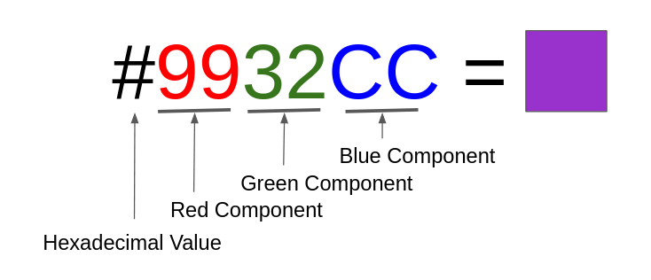
If you look at the color values in the example above, you will notice that the color values don’t really look like color names unless you’re familiar with how computers talk about color!
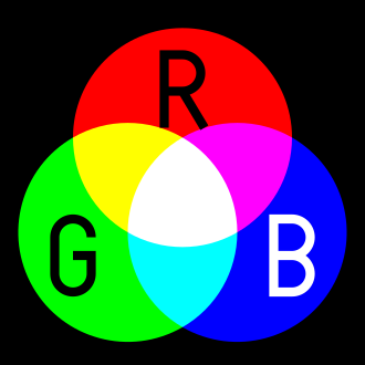
Did you know that you can use just three basic colors to make all other colors??
Click on the header below to expand this section and learn more about colors!
RGB Colors - A short introduction
As we were saying, it’s possible to represent lots of different colors by “mixing up” only 3 basic colors. Because of that, computers let you specify the specific color you want by telling it how much Red, Green and Blue your color consists of.
Each color component spans from 0 to some maximum number, say 255 (to know why 255, you need to know how computers store
data).
So, if you want pure red, you tell the computer you want 255 Red, 0 Green, 0 Blue. In computer terms,
this is represented as something like 255-0-0, but with each color represented by two hexadecimal digits…
because 255 is FF and 0 is just 00 in hexadecimal, the red color becomes #FF0000
You may be wondering why the hell 255 is FF in hexadecimal.
Click here if you’re interested in the details, but roughly,
in our “normal” number system, the decimal system, numbers are represented using only 10 symbols, the ones you’re
familiar with from school: 0, 1, 2, 3, 4, 5, 6, 7, 8, 9.
To represent the number that comes after 9, you need to combine two symbols because there’s no more symbols available!
That’s why ten becomes 10.
But there’s no reason why we should only use 10 symbols… we could use a few letters, like A, B, C, D, E, F, to
represent the next numbers: i.e. A = ten, B = eleven, C = twelve, D = thirteen, E = fourteen, and F = fifteen.
Now, the first 16 natural numbers become 0, 1, 2, 3, 4, 5, 6, 7, 8, 9, A, B, C, D, E, F.
After F, we may accept defeat and start combining symbols as we did before, starting again from 10, which now
represents whatever comes after F… and because F is fifteen, that means that 10 = sixteen!
And hold and behold: we have created the hexadecimal number system, so-called because it uses 16 symbols instead of the 10 symbols of the decimal system. Cool, isn’t it?
And that’s why colors in CSS can be represented by values like #9932CC.
Check out some colors with their hexadecimal values in the w3schools website.
CSS also allows you to specify colors by name (e.g.
color: red;), decimal RGB components (e.g.color: rgb(255, 0, 127);), and a whole different color system known as HSL. Check the MDN Color article if you’re really into colors!
Organizing your website
A web page always has something called a layout, which defines how page elements, like the headings, text, footer etc. should be laid out.
For example, you probably want to have some links near the top of the page taking users to your website’s main pages… some cool content in the middle… and a footer with a link to your profile on Twitter or LinkedIn.
To be able to organize things and place them where we want them to be, we need to learn a few new tags first.
We will focus on just adding content to the website in this section… in the next section, we’ll try to make things actually look pretty and more interesting.
From now on, most HTML examples will include only the part that goes within the
<body>tag, for briefness.
content side-by-side: <span>
<span>Hello </span>
<span style="color: red">HTML</span>
<span style="color: blue">!<span>
content in new lines: <div>
<div>Hello</div>
<div style="color: red">HTML</div>
<div style="color: blue">!</div>
lists of items: <ul> and <ol>
Note: ul stands for unordered list, ol for ordered list, and li for list item.
<ul>
    <li>Milk</li>
    <li>Bread</li>
    <li>Butter</li>
</ul>
<ol>
    <li>Computer</li>
    <li>Monitor</li>
    <li>Printer</li>
</ol>
tables: <table>
Tables are broken up into a table head, <thead>, and a body, <tbody>…
<tr> indicates a table row.
Within a <thead>, cells values are given withing <th> tags, and within <tbody>, cell values go within <td>
(table data) tags.
Unfortunately, to make a table look decent you need to use CSS, which we’ll learn in a moment.
<table>
  <thead>
    <tr>
      <th>Fruit</th>
      <th>Quantity</th>
    </tr>
  </thead>
  <tbody>
    <tr>
      <td>Apple</td>
      <td>2</td>
    </tr>
    <tr>
      <td>Orange</td>
      <td>5</td>
    </tr>
  </tbody>
</table>
links: <a>
One of the most important tags in any website is the <a> tag, which makes hyperlinks,
allowing a web page not only to link to other web pages on the same website, but to any other website in the world
(that’s what makes the World-Wide-Web work)!
<h3>Search Engines:</h3>
<ul>
  <li><a href="https://google.com">Google</a></li>
  <li><a href="https://duckduckgo.com">DuckDuckGo</a></li>
  <li><a href="https://www.bing.com">Bing</a></li>
</ul>
The links above may not work due to the target websites forbidding “framing” their content within other websites, as I am doing here. If the links were on a normal website (not framed), they would work fine.
semantic tags: main, header, section…
HTML also has semantic tags that can be used to organize content nicely.
This example shows a few of them in use:
<header>
    <h1>My web page</h1>
</header>
<main>
    <section>
    <header>
        <h2>First Section</h2>
    </header>
    <p>This is a web page.</p>
    <p>
    Web pages can <a href="https://en.wikipedia.org/wiki/Hyperlink">link</a>
    to each other!
    </p>
    </section>
    <aside>There are 1.74 billion websites in the world!</aside>
</main>
<footer>
@Copyright MyName 2020
</footer>
separator: <hr>
If you ever want to add a separator between content, use the <hr> tag (horizontal rule):
<section>
First section
</section>
<hr>
<section>
Second section
</section>
<hr>
<section>
Third section
</section>
text decorations: <em>, <strong>, <q>, <s>, <code>, <pre>
As a publishing tool, HTML has several tags that allow customizing how text is displayed:
<em>- emphasis.<strong>- strong/important.<q>- quotation.<s>- strikethrough.<code>- computer code.<pre>- pre-formatted.
The next example shows how to use these tags. It also shows how you can include the < and > symbols which would
normally be treated as tag delimiters.
- to include
&in a document, use&(ampersand) instead. - to include
<, use<(less-than). - to include
>, use>(greater-than).
You may have noticed that HTML does not display whitespace and new-lines in text the way you might expect. When you want whitespace and new-lines to be maintained, using the
pretag can be very handy, as you can see in the example below!
<p>
Before we proceed, it is <strong>very important</strong>
to note that you <s>must</s> should not <em>overuse</em> HTML tags.
</p>
<p>
HTML tags like
<code><em></code> and
<code><strong></code>
only help add basic formatting to text.
</p>
<p>
For more advanced styling, you need <strong>CSS</strong>. For example:
</p>
<pre>
p {
font-weight: bold;
font-size: 20px;
}
</pre>
<p>As Oscar Wilde said:</p>
<q>Everything in moderation, including moderation.</q>
This should be enough for you to create most kinds of web pages you might need.
Before we move on to styling the content we’ve written, let’s create a simple page layout for our website that we’ll use in later examples and that might look closer to what you might want your own website to look like.
<!doctype html>
<html lang="en">
<head>
    <meta charset="utf-8">
    <title>My Website</title>
<body>
<header>My Website</header>
<nav>
<ul>
    <li><a href="#">Home</a></li>
    <li><a href="#">Blog</a></li>
</ul>
</nav>
<main>
    <h1>Hello</h1>
    <p>This is my website.</p>
</main>
<footer>
Follow me on <a href="https://twitter.com/renatoathaydes">Twitter</a>!
</footer>
</body>
The
HomeandBloghyperlinks above don’t really link to anything yet (they point to#in the example, which doesn’t go anywhere). We’ll see later how to split our website into multiple pages so that we can link them from each other.
This page has a more proper structure, but it still looks terrible, I know.
To position its parts correctly and make it look interesting, we must use CSS!
Even though there are a lot of ways to place elements with CSS, one of the most powerful, yet simple to understand, is called Flexbox.
If you just want to have a simple website without a fancy layout, or you find CSS too difficult, you might skip the next few sections! You can still have a beautiful website even with little knowledge of CSS by using a minimalistic CSS framework like Miligram or siimple, or just importing a drop-in CSS stylesheet into your website.
Positioning things with Flexbox
Flexbox lets us align the children of an element (the parent) in a flexible manner… flexible in the sense that, unlike other alternatives, it doesn’t require each child to have a fixed size. Instead, it tries to let each child take up as much space as it needs, with options to tweak that precisely.
Before we try to position the elements in our current layout, let’s look at a simpler structure and see how flex positions children depending on attributes on both parent and children.
To enable Flexbox, we use CSS to set the style property display: flex; on the parent element, i.e. the element we
want to be a container for the other elements.
We also need to set the appropriate value for the justify-content property.
The following example shows the possible values for justify-content:
<!doctype html>
<html lang="en">
<head>
    <style>

body {
  font-family: Arial;
  background-color: #333333;
  color: lightgray;
}

.label {
  padding: 1em;
  font-size: 2em;
  font-family: Courier;
}

#jc-value {
  color: green;
}

.container {
  display: flex;
  justify-content: space-between;
  max-width: 80%;
  border: solid 1px limegreen;
  padding: 1px;
}

.box {
  padding: 10px;
  color: black;
}

.one {
  background-color: cyan;
}

.two {
  background-color: green;
}

.three {
  background-color: yellow;
}

.four {
  background-color: orange;
}

    </style>
</head>
<body>
<div class="label">justify-content=<span id="jc-value">"space-between"</span></div>
<div class="container">
    <div class="box one">One</div>
    <div class="box two">Two</div>
    <div class="box three">Three</div>
    <div class="box four">Four</div>
</div>
<script>
// ... script to modify justify-content value,
// ... hidden for brevity as it's not relevant at this stage
</script>
</body>
</html>
We introduce several new concepts in this example, but hopefully it’s not too hard to understand:
- the
font-familyCSS-property, which is used to set the text font of an element. - CSS classes,
which can be used to group different elements (to style elements with class
box, use CSS selector.box). - ID attribute, which identifies a single, unique element in the page (to style the element with ID
jc-value, use CSS selector#jc-value). - the
paddingCSS-property, which adds spacing within an element’s area. - the
borderCSS-property for styling element’s borders. - the
max-widthCSS-property for limiting the size of an element. - a
scripttag can be used to add interactivity or dynamic content to a web page, normally using the JavaScript programming language. This is how web apps (like GMail or Facebook) can be implemented.
CSS class- and ID-based CSS selectors can be combined.
Size CSS-properties are specified in absolute units like
px(pixels) or relative units likeem(font-relative unit). Check css-tricks’s The lengths of CSS blog post for details.
One more important thing about Flexbox is that it can also get elements to be placed alone on a single row, and even change the order in which the elements are displayed, overriding the position they appear in the HTML text.
To find out how to do that, and more, have a look at the Complete Guide to Flexbox article at css-tricks.com.
If you’re into games, try Flexbox Froggy, a fun way to learn Flexbox while playing a game.

Finally, if you find FlexBox hard or want to try a different layout system that supports grids more easily, have a look at GridBox.
This blog post by CSS pro Josh W. Comeau shows some really cool layout techniques using GridBox that can help you make your website look really professional!
To recap, this is the layout that we had previously:
<!doctype html>
<html lang="en">
<head>
    <meta charset="utf-8">
    <title>My Website</title>
<body>
<header>My Website</header>
<nav>
<ul>
    <li><a href="#">Home</a></li>
    <li><a href="#">Blog</a></li>
</ul>
</nav>
<main>
    <h1>Hello</h1>
    <p>This is my website.</p>
</main>
<footer>
Follow me on <a href="https://twitter.com/renatoathaydes">Twitter</a>!
</footer>
</body>
We should now be able to get the element’s positions fixed up using Flexbox!
The example CSS below shows one way to do it:
body {
  font-family: "Gill Sans", sans-serif;
  margin: 0;
}

header {
  font-size: 2em;
  padding: 2em;
  background-color: gold;
}

main {
  margin: auto;
  padding: 0 1em 0 1em;
  min-height: 20em;
  max-width: 60em;
}

nav {
  display: flex;
  flex-flow: row wrap;
  justify-content: flex-end;
  padding-right: 1em;
  margin-top: -2.4em;
}

nav > ul > li {
  display: inline;
  margin-left: 1em;
}

footer {
  display: flex;
  justify-content: center;
  padding: 1em;
  background-color: #3333;
}
Elements are now finally where you might expect them to be!
To place the nav element inside the header (the golden area) notice that I used a negative margin. That is a
common way to make element’s contents overlap.
In order for the nav links to show up near the bottom-right corner of the header, I used FlexBox’s justify-content: flex-end;
on it, and to make sure its elements did not get too close to the border, I added padding-right: 1em; so there’s some
space between the border and the last nav link.
To style the nav links I used the nav > ul > li selector: this means that the CSS rules should apply only to li
tags that are children of ul tags that are children of nav tags!
The display: inline CSS rule was used to force the li items to display on the same line (they would take their own
lines otherwise).
Everything else in this CSS we should’ve met before, so you can, I hope, make sense of everything!
If you don’t like this layout, feel free to modify it to match your preferences! That’s the point of writing your own website: you can do anything with it.
I hope that this example is at least useful for you to understand what you need to do to get things placed where you want them to be without struggling too much.
Alternative Layout - adapting to mobile screens
This extra example shows a few things that could be very handy to know:
- how to put an element on a fixed position on the screen, so that it follows the user as they scroll.
- letting Flexbox elements grow to take up as much space as you want it to.
- how to change the layout depending on the user’s screen size.
Pretty advanced stuff!
<!doctype html>
<html lang="en">
<head>
    <style>

body {
  font-family: "Gill Sans", sans-serif;
  margin: 0;
  display: flex;
  flex-wrap: wrap;
}

header {
  font-size: 2em;
  padding: 2em;
  background-color: gold;
  width: 100%;
}

main {
  margin: auto;
  padding: 0 1em 0 1em;
  min-height: 20em;
  max-width: 60em;
  flex-grow: 1;
}

nav {
  display: flex;
  flex-flow: row wrap;
  justify-content: center;
  padding-right: 1em;
  width: 5em;
  background: #eeeeee;
}

nav > ul {
  position: fixed;
  list-style-type: none;
}

aside.ads {
  padding: 2em 1em 1em 1em;
  width: 10em;
  background: #eeeeee;
}

/* Small screens */
@media screen and (max-width: 460px) {
  nav {
    display: float;
    width: 100%;
    justify-content: flex-end;
    margin-top: -2.3em;
    background: none;
    line-height: 0;
  }
  nav > ul {
    position: relative;
  }
  nav > ul > li {
    display: inline;
    margin-left: 1em;
  }
  aside.ads {
    padding: 2em 0.2em 2em 0.2em;
    width: 6em;
  }
}

footer {
  display: flex;
  justify-content: center;
  padding: 1em;
  background-color: #3333;
  width: 100%;
}

    </style>
</head>
<body>
<header>My Website</header>
<nav>
<ul>
    <li><a href="#">Home</a></li>
    <li><a href="#">Blog</a></li>
</ul>
</nav>
<main>
    <h1>Hello</h1>
    <p>This is my website.</p>
</main>
<aside class="ads">
  <div>YOUR ADD HERE!</div>
</aside>
<footer>
Follow me on <a href="https://twitter.com/renatoathaydes">Twitter</a>!
</footer>
</body>
</html>
Try changing the size of your window and scrolling up and down!
You should notice that, on a large screen, the navigation menu is shown on the left of the page and the links follow you as you scroll up/down. This is useful if you want to keep some links always handy regardless how far down the page the user has scrolled (this can be quite annoying though, use with moderation!).
That fixed position of the navigation menu is achieved with the rule position: fixed;! Easy…
Check out the MDN Article on position to learn all about
that, including how to create annoying popups or just shifting thing’s positions around.
The trick to move the navigation menu back to the top of the page when the screen is too small to show it on the left of the page is a bit more complex… it relies on CSS Media Queries.
Even though there is a lot to learn about this topic, you can get away with most things just by knowing how to change CSS rules based on the size of the user’s screen.
Here’s the relevant part of the CSS used in our example:
nav > ul {
  position: fixed;
  list-style-type: none;
}

aside.ads {
  padding: 2em 1em 1em 1em;
  width: 10em;
  background: #eeeeee;
}

/* Small screens */
@media screen and (max-width: 460px) {
  nav {
    display: float;
    width: 100%;
    justify-content: flex-end;
    margin-top: -2.3em;
    background: none;
    line-height: 0;
  }
  nav > ul {
    position: relative;
  }
  nav > ul > li {
    display: inline;
    margin-left: 1em;
  }
  aside.ads {
    padding: 2em 0.2em 2em 0.2em;
    width: 6em;
  }
}
The important line is:
@media screen and (max-width: 460px) { ... }
Which says that all rules inside this block should only apply if the user’s screen has a maximum width of 460px (i.e. it’s probably a mobile phone held upwards). These rules override the rules declared earlier.
For example, on big screens, we’ll give our ads width: 10em; (we’ve gotta make some cash, right?!), but on a small
screen, that would take nearly half of the space, so we change it to a more tolerable width: 6em;.
We also stop making the navigation items have a position: fixed by declaring position: relative;, which turns the
navigation items’ positions back to the default.
Making things more stylish

Image by NEXTPNG
We have something now that already looks like a real website, but perhaps not a very pretty one (though it’s pretty close to this very website you’re reading this on! Some people, like me, just like simplicity…).
Let’s see what we can do to add some flair to it.
One thing a lot of people like to do is use a beautiful image in the background, instead of a dull, yellow banner as we currently have.
This is very easy to do, the only difficulty is finding a nice picture!
Remember that this picture is going to be downloaded by all your website visitors, so try to pick one that’s not too big. Usually, anything over 1MB is frawned upon by some people, so unless it’s a really amazing picture, try to keep it light.
I don’t know what kind of image you would choose, but I find this one really beautiful:

Iceland, courtesy of Benjamin Suter @ pexels.com
To show this image on a web page, we can use the <img> tag as I’ve done above:
<img src="https://images.pexels.com/photos/3617500/pexels-photo-3617500.jpeg?auto=compress&cs=tinysrgb&dpr=3&h=750&w=1260"
     alt="Aurora Burealis over Iceland's icy mountains">
The alt attribute is used to display some text if the image is not found, and by accessibility screen readers.
To confirm the tag shown above is indeed what is included in this web page’s HTML, you can inspect this page using the developer tools which are present in most browsers! Doing that is a great way to learn how to do something you like from another website. Check this Mozilla article on Developer Tools for more information.
If you want to create a gallery of images, you can use your newly gained knowledge of FlexBox to do that.
<head>
<link rel="stylesheet"
      href="https://fonts.googleapis.com/css?family=Tangerine">
<style>
* {
  font-family: "Tangerine", serif;
  font-size: 24px;
}
header > h2 {
  font-family: "Tangerine", serif;
  font-size: 48px;
  color: gray;
  text-shadow: 4px 4px 4px #aaa;
}
.gallery {
  display: flex;
  justify-content: space-evenly;
  flex-flow: row wrap;
}
.gallery figcaption {
  margin: 7px 0 0 15px;
}
.gallery img {
  width: 300px;
  margin-top: 20px;
  margin-left: 15px;
}
</style>
</head>
<body>
<head>
  <link rel="stylesheet" href="https://fonts.googleapis.com/css?family=Tangerine">
</head>

<body>
  <header>
    <h2>Northern Lights Gallery</h2>
  </header>
  <div class="gallery">
    <figure>
      <img alt="northern lights over mountains" src="https://renato.athaydes.com/images/how-to/web/pexels-benjamin-suter-3617500.jpg">
      <figcaption>Beautiful lake and mountains</figcaption>
    </figure>
    <figure>
      <img alt="northern lights over snow field" src="https://renato.athaydes.com/images/how-to/web/pexels-pixabay-41004.jpg">
      <figcaption>Bright Northern Lights</figcaption>
    </figure>
    <figure>
      <img alt="northern lights over snowy mountain" src="https://renato.athaydes.com/images/how-to/web/pexels-tobias-bjorkli-1559817.jpg">
      <figcaption>Incredible colors</figcaption>
    </figure>
  </div>
</body>
</body>
The example above uses a free Google Font called Tangerine, by Toshi Omagari.
I used the above example to show how you can use freely available custom fonts to make your website really shine. The text shadow is given by
text-shadow: 4px 4px 4px #aaa;.
If you resize this window, you should see how the images will jump to the next row if not enough space is available
on a row, thanks to flex-flow: row wrap;.
Another way to display an image on a web page is by using CSS.
To place our chosen image in the top banner of our website we can set the background-image
CSS-property to the image’s URL:
showing only the modified CSS from the previous example
header {
  font-size: 2em;
  padding: 4em;
  background-position: 0 43%;
  background-image: url("https://images.pexels.com/photos/3617500/pexels-photo-3617500.jpeg?auto=compress&cs=tinysrgb&dpr=3&h=750&w=1260");
  background-size: 100%;
  color: white;
}

footer {
  display: flex;
  justify-content: center;
  padding: 1em;
  background-color: darkcyan;
}

a {
  color: yellow;
}

a:visited {
  color: white;
}
The
a:visitedCSS selector above selectsatags that link to content you’ve already visited. It’s an example of a pseudo-class (other common ones are:hover,:enabled,:first-childand:last-child).
I increased the padding on the header element in order to make the top banner even bigger (some people love it when
it’s much bigger still! If you are one of those, use something like min-height: 200px for example, adjusting the
size until you’re happy with the result) and used the background-position
CSS-property to shift the image’s position (0 43% means no x-axis shift, 43% shift on y-axis) to where I thought it
looked best.
CSS Animations
CSS is very powerful, as you might’ve noticed already… it even supports animations, so you can, for example, make your banner’s image slowly move, giving a powerful effect if you use it wisely:
showing only the modified CSS from the previous example
@keyframes panning {
  0% {
    background-position: 0% 0%;
  }
  50% {
    background-position: 0% 50%;
  }
  100% {
    background-position: 0% 0%;
  }
}

header {
  font-size: 2em;
  padding: 4em;
  background-position: 0 43%;
  background-image: url("https://images.pexels.com/photos/3617500/pexels-photo-3617500.jpeg?auto=compress&cs=tinysrgb&dpr=3&h=750&w=1260");
  background-size: 100%;
  color: white;
  animation: panning 60s infinite linear;
}
Notice how I only had to declare a new @keyframes element telling the browser how to change the background-position
(it starts with value 0% 0%, changes to 0% 50% at the half mark, then goes back to the initial value),
named it panning, then used it in the header CSS with the line animation: panning 60s infinite linear.
This means that the animation:
60s- should take 60 seconds.infinite- should start again over and over.linear- should change the animated property linearly (at a constant rate).
Quite simple and makes for a very nice effect!
Many CSS properties can be animated.
For example, you can also use CSS animations to make the background-color of an element change gradually
(in this example, we make it look like it’s pulsating by using the ease-in-out
timing function):
<!doctype html>
<html lang="en">
<head>
<style>
@keyframes pulse {
  0% {
    background-color: darkblue;
  }
  50% {
    background-color: dodgerblue;
  }
  100% {
    background-color: darkblue;
  }
}

html {
  height: 100%;
  animation: pulse 2s infinite ease-in-out;
}
</style>
</head>
</html>
Or to move some element around:
<!doctype html>
<html lang="en">
<head>
<style>
@keyframes slide-out {
  100% {
    margin-left: 60%;
  }
}

.animate {
  color: green;
  font-size: 2em;
  text-align: center;
  border: solid 2px blue;
  max-width: 12em;
  animation: slide-out 3s ease infinite;
}
</style>
</head>
<body>
<div class="animate">
  CSS animations rock!
</div>
</body>
</html>
As usual, Mozilla has a great article on CSS Animations. You should definitely check it out if you want to learn more about animations.
And if you want to get truly amazed, have a look at what the CSS pros can achieve.
Including Media
As I had mentioned in the introduction, HTML can also include media like video and music!
I think we’re ready to do that now!
How about some Bossa Nova?
<!doctype html>
<html lang="en">
<head>
<meta charset="utf-8">
<style>
.title { font-size: 1.3em; }

.description {
  font-style: italic;
  line-height: 1.5em;
}

audio { padding: 1em; }
</style>
</head>
<body>
    <div class="title">The Girl from Ipanema (Garota de Ipanema)</div>
    <div class="description">by Antônio Carlos Jobim and Vinícius de Moraes</div>
    <audio controls>
        <source src="https://renato.athaydes.com/music/The_Girl_from_Ipanema_sample.ogg" type="audio/ogg">
        Your browser does not support the audio element.
    </audio>
<body>
</html>
Put some headphones on and enjoy this masterpiece…

Painting by João Barcelos
After a long article like this, Bossa Nova may not be enough… you might feel like taking a break, perhaps watching a relaxing video… well, in that case, you don’t need to leave just yet, there’s one just below!
Spoiler alert: it contains lots of cats!
This example shows how you can embed a video from Youtube or Vimeo on your own website (don’t feel bad for watching the entire thing, you deserve it!):
<iframe src="https://player.vimeo.com/video/120960056" width="640" height="360" frameborder="0" allow="autoplay; fullscreen" allowfullscreen></iframe>
<p><a href="https://vimeo.com/120960056">Cats</a> from <a href="https://vimeo.com/user5928434">Lonely black cat</a> on <a href="https://vimeo.com">Vimeo</a>.</p>
Both YouTube and Vimeo have a share button which has an option to copy a video’s embeddable HTML. This YouTube Guide explains how to do it in detail for any YouTube video.
As you can see, it uses an iframe tag, which is used
to embed another website, or a part of it, into your own website!
As an aside: this is how I created all these examples you’ve been seeing.
An iframe can link to another website’s URL or to a
so-called data URL - I used the latter
kind of URL so that, basically, I don’t need to set up another website to host these examples, it’s all included in
this page’s HTML itself.
If you have a video hosted on your own website (i.e. the video file is in your website - we’ll see later how to include
other files in a website), there’s a video tag which is very similar to the audio tag that
you can use instead.
This HTML snippet:
<video controls width="750px" style="max-width: 90%">
    <source src="https://renato.athaydes.com/images/how-to/web/pexels-video-1739010.mp4"
            type="video/mp4">
    Sorry, your browser doesn't support embedded videos.
</video>
Produces the following:
Video by Joseph Redfield @ Pexels.
Beautiful. With this, we conclude our Tour of HTML!
The next sections will show how you can add other pages to your website and, finally, publish it online so that anyone in the whole world can see what you’ve created!
Splitting things up
We’re almost done now, but before we really have a website, we need to learn a few more things:
- how to split up HTML and CSS, so we can re-use the same CSS from many HTML files.
- how to include other pages on a website.
There’s only one problem: opening HTML files on a browser is not exactly the same as visiting a website online. Websites accessible on the Internet are not made up of local files, they are hosted by a web server on another computer.
A Web Server is similar to a file system that allows a browser to load files from another computer.
A website that only contains HTML pages, like the one we’re trying to create here, is basically a remote directory anyone on the Internet can access (but not change).
There are roughly two types of website: dynamic websites and static websites. The latter is the type of website we’re discussing in this blog post.
Dynamic websites can do more than static websites, but they are much more complicated. They require things like databases, a backend (a server that can use the database, send emails, facilitate interaction between users, make payment requests against your bank etc.), a login system and so on.
Static websites, on the other hand, are just simple files you upload as often as you wish (hence they are only as static as you want them to be) to a website host.
They don’t have most of the security issues associated with dynamic websites. The only security protection you need to worry about with a static website is limiting who can upload files to your website, which is usually a concern for the host you have an account with, not you!
Hence, to publish your website on the Internet so everyone can visit it, you need to upload a directory to a website host! But before we do that, we need to create the remaining files for our initial website.
The example website layout we have been using in this article had an index.html page and links to two pages:
Home and Blog. Home is normally the index.html file itself. Presumably, Blog would link to the blogs/index.html
file, which would then have links to all of your blog posts (themselves other html files under the blogs/ folder).
Here’s an example of a directory for such a website:
└── website
    ├── blogs
    │   ├── index.html
    │   └── post1.html
    │   └── post2.html
    ├── css
    │   └── style.css
    ├── images
    │   └── img1.png
    └── index.html
We had been writing everything in index.html.
The CSS stylesheet we included in the <style> tag is what gives our website its nice looks (hopefully!), so we want that to
be shared between most, if not all, our website’s HTML pages.
For this reason, it’s common to move the stylesheet to its own file, like css/style.css in the example directory above.
To do that, create the css/style.css file, then move the contents of the <style> tag into it. You can keep some
CSS rules in the <style> tag if they don’t apply to any other page. Up to you.
Here’s how you can then include the new CSS file in the index.html page:
<link rel="stylesheet" href="css/style.css">
The <link> tag, as the <style> tag, goes in the
<head>. Unlike the <style> tag, <link> doesn’t have any contents: it’s just a link to another file after all.
If you want to have a nice icon shown on the browser tab’s head when your website is open, you can use a
<link>tag like this:<link rel="icon" href="favicon.ico">.Place your
favicon.icofile in the same directory asindex.htmland the browser will automatically show it!
There’s no difference between including CSS rules via <link> or via <style>, except that <link> lets you re-use
your CSS rules on many HTML pages!
Go ahead and create the blogs directory, the blogs/index.html file inside it, and a few blog post files as well,
e.g. blogs/post1.html and blogs/post2.html.
You can basically copy the <head>, <nav> and <footer> from index.thml into all of them, so that your website pages look
all similar… the <main> content should be different, of course.
Here’s a simple example blog post file to help you get started:
<!doctype html>
<html lang="en">
<head>
    <meta charset="utf-8">
    <title>My Website</title>
    <link rel="stylesheet" href="/css/style.css">
<body>
<header>My Website</header>
<nav>
    <ul>
        <li><a href="/index.html">Home</a></li>
        <li><a href="/blogs/index.html">Blog</a></li>
    </ul>
</nav>
<main>
    <article>
        <h1>Blog Post 1</h1>
        <p>This is my first blog post.</p>
    </article>
</main>
<footer>
    Follow me on <a href="https://twitter.com/renatoathaydes">Twitter</a>!
</footer>
</body>
Notice the link to the CSS stylesheet in the <head>, and how the <nav> links now refer to other existing HTML
files!
If you want to see this simple Demo Website in action, click here!.
The source code (HTML/CSS files) can be found in this repository.
Publishing your website
This is the moment you have been waiting for! You’ve learned how to write HTML and CSS, created a nice landing page for your website, perhaps wrote a couple of blog posts, and are now ready to publish it online for all to see!
Luckily, this is the easiest part!!!
Netlify makes it as easy as drag-and-dropping the website folder onto their dashboard.
I have no affiliation with Netlify, but this very website you’re reading now is hosted by them, for free!
They are one of the best web hosts out there offering free hosting! After you’ve created an account with them,
go to app.netlify.com/drop and just drag-and-drop your website folder to get it published
online (notice that only this step is mandatory - don’t worry about the next steps, Set up a custom domain and
Secure your site with HTTPS, as they are only required if you want to buy your own domain, as I explain below… and
the website will be secured with https anyway)!
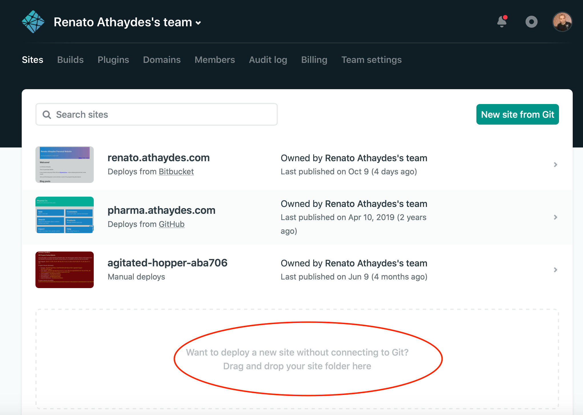
Here’s what my Netlify Dashboard looks like (besides this website, there’s a few old experiments I’d made):
If you don’t want to create an account with Netlify, there are quite a few other good options as well:
- Digital Ocean
- Amazon S3
- GitHub Pages
- Firebase (by Google)
Some of them, including Netlify, allow you to easily set up your own domain,
which means your website could be running on yourname.com instead of something generic (but free) like
modest-colden-61cc7e.netlify.app… however, this costs a little bit of money, which can be as little as
10 dollars per year depending on the demand for the domain name. In my opinion, it’s really worth it if you want
to have your own space (really yours, not like Facebook!) on the web, with your own name and maybe even brand!
Next Steps
Even though we’ve covered a lot of ground, there’s still a lot of things you can learn to become better at making websites.
Here are a few recommendations for you to read further:
You might want to learn a Static Website Generator in order to make some tasks easier in the long run.
Why Static Website Generators?
You might have noticed that when we created new pages for the website, we needed to copy/paste quite a bit of HTML. This is bad because if you want to change those bits later, you’ll need to change it in every page! Static website generators solve that problem for you… they also normally let you write most of your content using Markdown (that gets converted to HTML by the website generator), which is much easier to write if your content is mostly plain text.
There are lots and lots of static website generators. I use one to generate this website! I wrote it myself and it’s called Magnanimous. However, I am the only user I know of ;) the most popular options for non-programmers (as the current trend is for them to use JavaScript for everything) are probably Hugo, Jekyll, 11ty and GitBook.
If you’re serious about making websites, perhaps take an online course like codecademy’s Make a Website.
If you’re not afraid of writing code, you might also want to learn JavaScript. It will help you add more interaction to your website. You could, for example, allow your visitors to dynamically filter the content they see, or automatically update an element with the current time or weather and things like that.
Welcome to the real Web
As you’ve noticed, by creating your own website from scratch, you own everything in your website. It’s an amazing feeling to know you’ve created everything with your own hands, knowing that no one can mess with or censor your content. A web host is just that: a host… you can change it at any time and carry your website with you wherever you decide to go.
Specially if you bought your own domain.
Congratulations for taking control of your online presence!!